The attraction of pretty wine bottles
- Nov 1, 2021
- 7 min read
“It can be extremely romantic, it can be tactile, but ultimately it’s about communicating to the consumer what that brand represents or what the product is about, and then tell that story,” Scott Carslake

The other day we bought this wine. It's an Aldi special, and I have to say the the main driver for it's very cheap purchase, was, for me anyway, the bottle. Well I do like rosé and this had some sort of gold label, and Aldi's quaffing wines are usually pretty nice. Moreover this was from the Loire Valley to which I am emotionally attached because of my teenage summer holidays there. Well not quite in this part of the Loire valley, as it is from the Anjou region - nearer to the sea than I was - near Orléans. But it was so pretty - the bottle itself in particular because of the dimpled glass. I'm always on the lookout for pretty bottles in which to put things like limoncello or plum brandy. We opened the first bottle this weekend. Well I did, and what a mess I made of that because it was of course a cork. The French are still resisting the screw cap. I broke the cork and it took me two or three goes to get it out, with it crumbling more and more as I went. Fortunately though I didn't get any of the crumble in the bottle, and therefore the wine. It was a very pleasant rosé - not sensational, but then it only cost $10.00. So we are not talking classy here. As I say, it was all about the bottle, the label and the name as well in this case. 'Soupçon de fruit'. Soupçon (a lovely sounding word) means a taste, but a small one, sort of a 'hint of fruit'. And yes there was definitely a hint of some kind of fruit. I suppose it was what we expected, nice but not so nice that we would rush out to buy some more. Mind you I noticed, when I bought my four bottles, that there was only one remaining, so I'm guessing that lots of other people liked the bottle too.
When we lived in Adelaide for four years in the 80s we became friends with Stephen George of Ashton Hills Vineyard in the Adelaide Hills. The connection was children. Ashton Hills was just beginning back then, there were only a few vines and they were handpicked - we helped once, and trod them in a bucket. Well I don't know whether they all were, but I certainly remember treading some - very spiky. Stephen, with no malice at all, merely interest, got me to taste his wines and say whether I liked them or not - as the common man/woman example of his customer base. However, the other thing that I remember was that he was one of the early adopters of pretty labels. Below you see a bottle of one of his galah wines - cheap wines he sold with a separate name, because I think they were remainders from other vineyards. They may have been cheap but the sparkling wine that we bought once was the best sparkling wine I have ever tasted - and that includes some of the greatest. It tasted of strawberries. The galah label you see below is his second version - actually I think the first one was better - just the galah and silver handwriting. I also remember the first Ashton Hills label, which I vaguely remember was crafted from a drawing by his partner in life - the amazing Peta - alas now long dead. He has gone from strength to strength - his Pinot Noirs are among the best in Australia, so I wish him well in his semi retirement.


My other 'story' about labels comes from France, and Stéphane of Chateau de Quercy in the St Emilion region. I wrote about him before. He told us of a trip to the USA when he saw his bottles on the shelf of a bar somewhere - traditional/classic Bordeaux kind of labels - a bit wonky he said - next to an array of beautiful labels on wine from Australia.
In my feeble way here, I'm trying to say that the label is important. Of course you may be looking for a particular renowned wine, or an old favourite, in which case the label won't matter, but if you are just browsing the shelves, then the label will matter. It's what will catch your eye, although there is a sexual difference apparently:
"Women preferred more creative, eye-catching, colorful, and ornate wine labels than men did. Similarly, women rated plain, less colorful logos lower in attractiveness than men did. Wineries have used this kind of data to create wines targeted specifically to female drinkers." Marianne McGarry Wolf - Quartz
And I suppose I have confirmed that by loving the flowers, and the dimples on my bottle of rosé. But what's wrong with that? Men, however, tend to prefer something plainer and more classic. I know that David gets a bit annoyed by too quirky names and over decoration.
So what do we like in labels? Well I think there probably isn't any definitive answer to that - it's like asking what artist you like - Michelangelo, Monet or Picasso - or all three perhaps, depending on your mood. That Quartz article was reporting on a survey of wine labels which said that
"the characteristics wine drinkers say they like: eye-catching, unique, stylish, creative, clever, and colorful."
And they mostly don't like animals. But then in that same survey the second most popular label was the Yellow Tail Shiraz and it's stylised wallaby/kangaroo. Next to it is the winner (this was an American Survey), which to my mind is a man thing. Not very appealing at all.


So I went in search of beautiful labels, and prize winners of design awards, and found that comment at the top of the page about the label telling the 'story' of the wine.
So if you go with that I guess the Yellow tail does it job in claiming its Australianness. It's also joyful, or is it aspiring? And it's certainly eye-catching, and surely that must be the main thing. Not sure I feel the same about the winner and I'm also not sure what it is telling me, other than it's American.
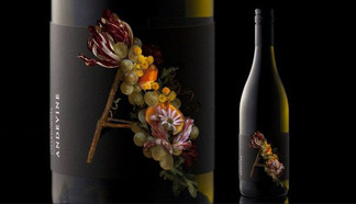
Anyway here are a few pretty, nay, in some cases really beautiful ones that I found. The first is one from our own collection - a local wine Shaw's Road Chardonnay, in which the label splits to show the wine beneath; De Bortoli's Florence Broadhurst Botrytis Semillon; The Merchant collection from Patritti in SA which won the International Wine and Spirit Competition's label award; D'Arenberg, The Gippsland Wine Company, Adevine Wines from the Hunter Valley; Hugh Hamilton and a selection of SA wines picked for an exhibition of SA wine labels - well it's art isn't it? All rather glorious. And there are lots more.


It's an industry these days - designing beautiful labels. Perhaps the only thing that might trump the label is the number of award stickers on a bottle. But you need to check what awards they actually are. You can't judge a book by its cover they say - and in this case the wine by its label, and I guess that's true, although, just like a book you can sort of at least slot the wine - or the book into a kind of category - is it classy or is it for the airport read, or the Saturday binge? As a schoolgirl I worked in my local library at the weekend and one of the tasks I was given was to put books on the 'recommended' stand. Now although I knew a lot of authors I mostly judged by the style of cover. I mean you can tell can't you, who the intended audience is by the style of the cover - and the title? And ditto for the wines. If it's a fairly standard classic kind of label then you know the winemaker is aiming his wine at a connoisseur - it's a snobby thing. You can't get much plainer than Penfolds after all can you? But such a distinctive red in the coating at the top and the writing of the name 'Penfolds.' Simple but classy.

"Wine has evolved over the past decade from a drink that exclusively was paired with food, to one that is now a beverage for all occasions—dining, socializing, relaxing, and celebrating. When wine was simply an accompaniment for food, labels could be dull and descriptive. But now their enhanced logos, images, and romantic stories reflect these new uses." Marianne McGarry Wolf - Quartz 2017
I admit I hadn't thought of that aspect of the whole wine label thing, but it's true isn't it? Wine is not only drunk with food. Apparently we don't read the back and the small print a lot, but if we do, really all we want to know is what to expect of the wine - the kind of taste. On the back of my pretty Aldi/Loire Valley rosé it says:
"a rosé blend from the Loire Valley. Pretty in pink, the wine reveals aromas of raspberry and cherry, underscored by citrus fruits. A chilled glass of this dry Rosé de Loire pairs perfectly with summer BBQ food, fresh salads, or even on its own."
Which tells you all you need to know - even a nod in the direction of that drinking of wine away from food. And if you recognised the raspberries, cherries and citrus, don't you feel good? The only thing it doesn't tell you is the type of grapes that went into that blend. The French don't do that. You're supposed to know what the blend is likely to be from its Appellation - in this case Rosé de Loire. For there are rules. In this case - I looked it up - it's Cabernet Franc, Gamay and Grolleau about which some are not very kind.
And as if that's not enough these days you can scan a QR code on some bottles - not on my cheap rosé - for more information.
"you might be sold on the novelty of virtual reality, scanning a code and label illustration to unveil a clever video story via your phone." Tony Love - In Daily
How very millennial somehow.

And just as a sort of postscript on the design of wine labels, it seems that the attention is now turning to the bottle that the label is on. Garçon Wines - an English company - is producing a flat plastic wine bottle - eco friendly - as it is made from recycled PET plastic, and can be recycled itself. It also is easier to store and pack for shipment. I'm sure that the wine aficionados won't be impressed but then they didn't like screw caps at first did they? And this bottle certainly looks good, although probably the texture/feel of it won't appeal.
“Since the Bordeaux and Burgundy style bottles were introduced in the 19th century to improve on the preceding 17th century onion bottle, the most significant developments have been the bag-in-box and the screwcap – both of which were introduced over 50 years ago.” Santiago Navarra - Garçon founder
The bag in the box is trying to make a comeback I hear as well.
Anyway, yet again I have confirmed what a sucker I am for beautiful design.


Comments