It starts with the plate
- Oct 10, 2025
- 6 min read
"I am so obsessed with my serving platters that before I decide on what to cook, I first select the platters I want to serve it on." Yotam Ottolenghi

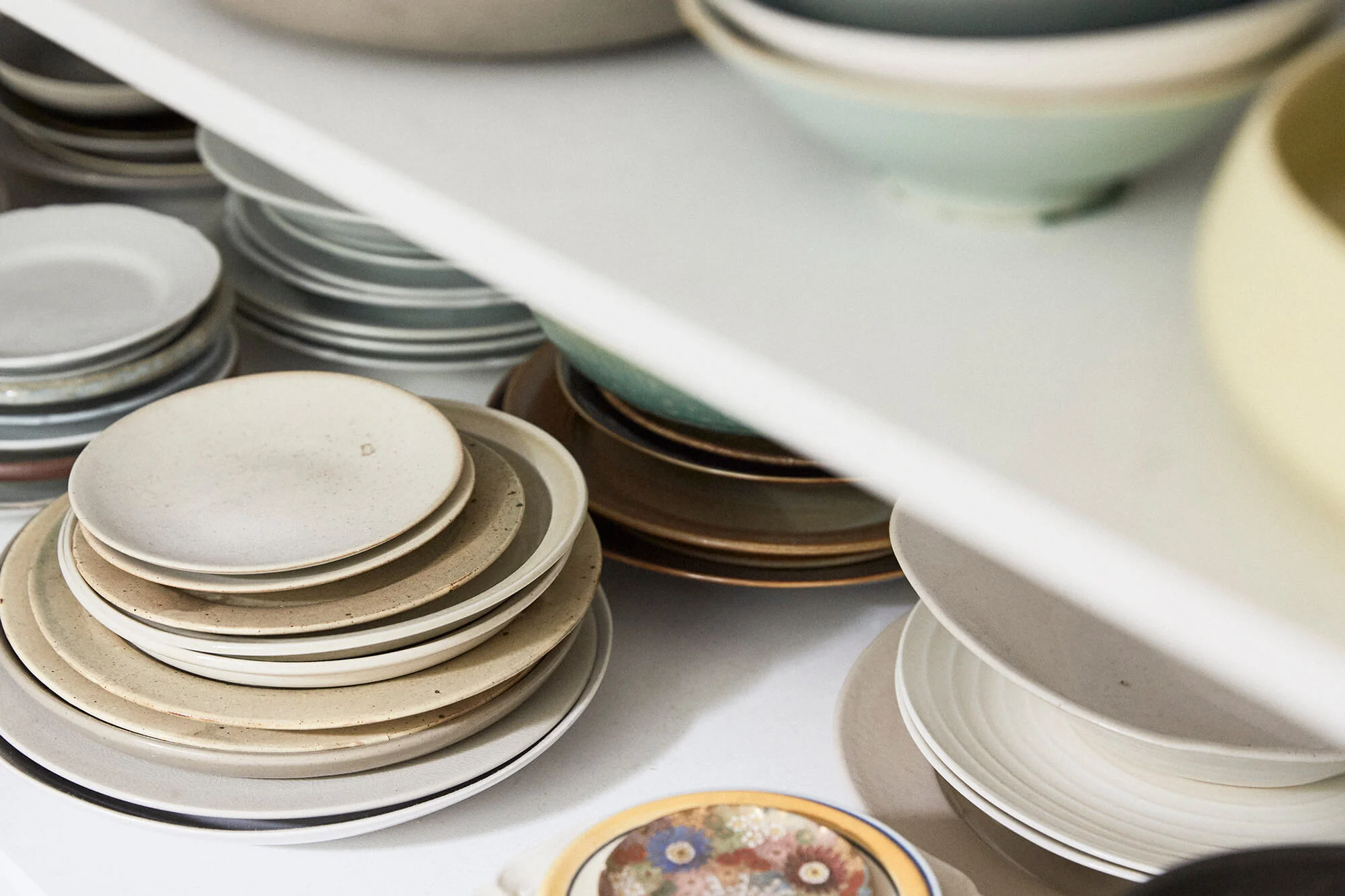
Chefs, of course, are particularly concerned with their plates - witness a few from Nigel Slater's collection here. These must be special ones because of the way they are displayed in his house. Because it seems that not only is he a bit obsessive, dare I say 'precious', about the quality of the food you buy, but he is also a collector of crockery - artisan, doubtlessly expensive crockery, lots of it Japanese. Works of art I guess you would call them. And it is quite noticeable that they are virtually all of a neutral hue, but very textural.
Below is a shot of some of his more everyday plates - at least I assume they are everyday, because they are just stacked on shelves, but nevertheless individual - not a 'set' to be seen. Ditto for Ottolenghi's home collection:

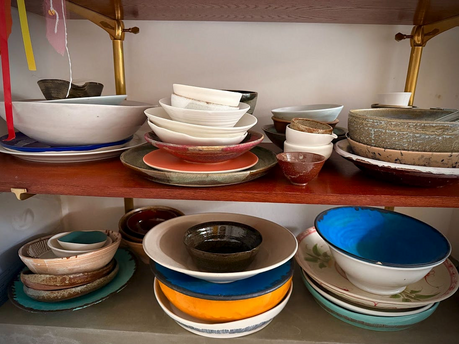
Ottolenghi's seems to include some with more colour however, which I guess is in keeping with the nature of his food.
I'm talking about plates, because Ottolenghi talked about them a fair bit, in the first part of his last newsletter article on salads - What makes an Ottolenghi salad? - part 3 and he began with that statement at the top of the page about choosing the plate before he even thinks about the food. Nigel thinks very carefully about plates too, but, I'm guessing, probably having decided on the food:

"I choose a plate from the pile with much thought about what it will hold. Will the food look lost or a little too snug? Will dinner feel comfortable with that hue of glaze? Such considerations were originally instigated by my job, where everything I cook is also photographed, but they have now become as much a part of life as choosing what we will drink with our dinner."
And all of his dishes for books, columns, whatever, are photographed at home on his own plates, not in a photographer's studio, where the plates have been selected by a stylist, sometimes to make a particular maker's plates look good as well as the food.
They come in and out of fashion too don't they? The current trend I would say from a totally ignorant standpoint is to go with the neutral - or - as we do on an everyday basis - with white. Even our 'best' Arabia set is pretty neutral a kind of beige, with a brown and pale green trim.
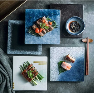
The shape is important too - I have a long and thin white platter that I rather love which is great for long thin things. Nigel doesn't like square ones, saying: "Food is difficult on a square plate, sushi's allowed but nothing else". I'm not quite sure whether he's right about that - see the sushi and other stuff below, although I admit that the other stuff is somewhat sushi like.


Before I leave the kind of plate idea, however, I note that Ottolenghi - or his marketing team - also has a range of plates that you can buy - seen here - and I have to say that many of them, although lovely, might be a difficult thing to match with food. Plates like the one in the centre, for example, are in many ways a bit useless as far as showing up the food is concerned. They are good for setting a table but not particularly valuable as far as showing off food is concerned. The face would be completely hidden by the food.
Nigel too says:
“I've got the odd rather lovely plate that has never worked, no matter what I put on it. But I keep on trying,”

As do I. I have a very few gifted and special plates, all of which I would love to use more, but which are difficult. The gorgeous brown plate in particular is really hard. I should think more about it. Something pale I suppose, although maybe something dark - if you were a clever food stylist that might look magnificent. I don't have many bought on my now long ago travels, because there was always the problem of weight and suitcases on aeroplanes.
A special plate, does make the food seem special though. A gift that in which we ordinary people are probably not able to indulge:
There is delight in selecting a plate, even if it is for yourself. Better still is picking one for someone else, something quietly perfect to hold sustenance you have made specially for them."
'Quietly perfect' is the key I think. I have now browsed dozens of pictures, trying to find some beautiful looking food on a complicated plate. Not one did I find. Everything was on neutral coloured plates. The most I saw was a single coloured line circling the plate.
So having now got your perfect, Maxwell &Williams, white plate how do you arrange your food in the best possible way? Well Nigel has general advice:
“If you think about it too hard, it doesn't work. It looks contrived. It looks a bit precious.”
And Ottolenghi has some more specific bits of advice.

And look - this example - his Bittersweet salad is on a square plate! And a slightly patterned one at that. But yes, you can see that the delicacy of the pattern on the plate and the plate itself, perfectly matches the delicacy of the salad. I chose it to illustrate this advice which he was really making with reference to the huge platters of salads in his delis but it does apply generally as well - as this example shows:
"it's important to leave some negative space around the edges - it makes everything look more striking They give a sense of plenty and abundance. They invite you to jump in, or join in; to take a big spoon and scoop out a generous portion"
He also reiterated his advice about layering
"Start with your foundation - grains, roasted vegetables, or a thick spread that can support everything else. Add a middle layer for richness - cheese, yoghurt, tahini - but don't spread evenly. Dollop or scatter so some base shows through. Finally, your top notes: herbs, nuts, a drizzle of oil. The key is making sure no two forkfuls are the same."

To illistrute I'm revisiting this beautiful Tomato and cucumber salad with tahini and spicy dukkah oil, that I used when I was talking about part one - which was about hero ingredients. But look at that subtle goldeny edging on the plate that perfectly matches the golden tahini sauce on the bottom - and the white space around it all, to highlight the colour of the tomatoes and the cucumber.

Which brings me to what has possibly become the Ottolenghi way of presenting lots of different dishes - a hollowed out base of something relatively solid - like this Labneh with confit tomatoes surmounted by your main thing, with all those bits on the top. This is a variation on his Hot charred cherry tomatoes with cold yoghurt, which I have mentioned many times.
Now I don't know whether it was indeed Ottolenghi who first thought of this kind of presentation, but it's certainly now an Ottolenghi trademark. Sometimes the base is a deepish well as above, and sometimes it's softer with just a slight impression in the middle, like the tomato and cucumbers above.
And another styling trick that he demonstrated in that newsletter, was the splatter spoon - as shown here in an aubergine, date and yoghurt salad - and alas the recipe for this one is not online. The newsletter has a little video though that shows you the trick of dipping a slotted spoon into yoghurt - or anything else - and then tapping it as you travel across the top of your salad.


Not so sure about that one.

I definitely don't think of the plate as the first thing, and I rarely think much about what plate to use either - it's all to do with the appropriate size of the plate really - as here - a kind of postscript - but one of those rare occasions when my 'best' Arabia ware was brought out. Well it was the right size.
It's Belinda Jeffery's Prosciutto-wrapped chicken with lemons, spring onions and potatoes, which was indeed lovely, but with one caveat - the spring onions. She said to just peel the spring onions and cut off the tops - well I think she might have meant all the green bits, because I just cut off the dodgy looking bits at the very top. They ended up very charred, and very chewy - the green bits that is. Maybe they would have been fine if they had been put in later, or if I had cut off more of the green bits. But yes, worth trying again. The rest of it was lovely.
YEARS GONE BY
October 9
2023 - I forgot to take any photos
2020 - Missing
2019 - The 'miracle' of chia seeds
2018 - Nothing
2017 - Silicone cookware
2016 - Supermarket wars in suburbia


Comments