Cookbook covers
- Sep 30, 2025
- 7 min read
"Cookbook covers are tricky because they need to convey the story and concept of the book in one photo." David Lebovitz

'You can't judge a book by its cover' they say. It's a saying that I'm not entirely sure I can agree with - even when, of course, it applies to other things in life - most notably people. So much depends on the perception of the viewer does it not? A question to which I shall return.
At the moment, just a word or two about where this particular post comes from - an interview with David Lebovitz of his An American in Paris blog fame. This is the cover of his latest book which is actually a new edition of an old book. Updated somewhat, but nevertheless an old book. The interview was in the Smitten Kitchen newsletter this week and the quote above caught my eye as a potential topic for musing upon - rambling around. Because I never seem to be able to keep in a straight ordered line.
In answer to the question "What's something you wish more people knew about your book?" he replied "How hard it was to get the cover right." Ultimately of course, we all know, that it's the content of a book - any book - that is the most important thing, although it is also an extremely subjective thing, and it doesn't necessarily stop us buying the book which is all that matters to the publishers. But there is no denying the importance of the cover because this is what first attracts - and like the content - the cover - including the all-important title, and the author - it is also extremely subjective.
Let's take the author. When it comes to cookbooks lots of us are not really even looking at the cover, or the content. We are just interested in the author - and here are three contemporary celebrity chef books for which what leaps out at you is the name of the author. The title of Ottolenghi's first book was just his name, Jamie Oliver was so well-known that his second book has a very small title - what leaps out at you is the name, and there is not even any food on the cover - just a motorbike and the young Jamie who became a bit of a pop star if you like. Ottolenghi at least had embossed pots and pans. Gordon Ramsay has equal billing with the title which because it's Home Cooking, has him standing in what is possibly a home kitchen, looking sort of friendly with immaculate hair, but probably not a real kitchen. A kitchen anyway.
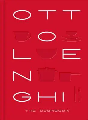


I am guessing Ottolenghi was relatively unknown back then so in addition to the fashionable name - with a tiny subtitle - The Cookbook - it is a large format hardcover in a brilliant red, maybe to catch the eye of those who were not familiar with the name. The other names are more well-known. So in these cases does that mean the cover doesn't really matter?
Maybe when the author is well-known but not hugely you need to make more of a splash with the cover, as in Ottolenghi's first book - and Ixta Belfrage's second book, Fusão (below) which I rushed out to buy because I was a fan. However, she is not as well known to the world of cookbooks and so the cover is bright and evocative supporting the subtitle - 'Untraditional recipes inspired by Brasil'. Hot sun, hot red, green jungle, blue water. Colourful, simple - the picture is somewhat abstract - exciting - "the story and concept of the book in one photo" - or in this case artwork. And one more - a dramatic cover for Joseph Abboud's Rumi. Foodies of Melbourne will probably know Rumi - a wonderful and trendy Middle-Eastern restaurant run by the chef Joseph Abboud, but I'm pretty sure neither he nor his restaurant would be particularly well-known elsewhere. And so you get this clever, and colourful abstract design with the suggestions of tables, bowls and other foodie things?, his name clearly shown and a subtitle "Food of Middle Eastern Appearance" that explains as well as drawing you in - 'appearance'' which is a bit intriguing. Ottolenghi did a similar thing with another early book that was based on his restaurant Nopi - dramatic minimalism and names. All that is required - plus the gold around the rim of the pan and on the page edges - a touch of class.


"There also needs to be room for the book title and author’s name" says David Lebovitz, as I have just demonstrated. And that title is important - Fusǎo for example means fusion, and even if you do not speak Portuguese - not many of us non-Portuguese I'm guessing - you could have a guess and besides you've also got that subtitle, plus, under her name, an explanation of who she is - "Bestselling co-author of Ottolenghi FLAVOUR and author of MECZLA". The Ottolenghi association and 'best-selling' being of major importance here. David Lebovitz did not mention the importance of the subtitle - not always there I have to say - but even he has one - 'My Best Recipes'.
He then mentions: "There’s such a trend right now to have good-looking people on book covers", which is true and I suspect something to do with the plethora of books from people who perhaps have popular blogs - such as these examples - and the self-published one I talked about the other day by a friend of my son. Similar, not exciting titles, just photos with a person holding a dish of some kind and pictures of smiling young people. All of which are obviously appealing to a different kind of audience - probably not me unless I know these people - but giving the impression that you can do what they do. Nothing really fancy here - well that's the impression you get.


The word 'trend' however is also worth considering. I'm not sure when the importance of the cover happened - and therefore that proverb about not trusting them, because books didn't really have covers, other than a protective shield of leather for most books before, I'm guessing, the early twentieth century. The title page was the thing, as shown here in the first edition of Mrs. Beeton's first massive tome. And the publisher's name was much more important back then as well. Or maybe the publishers thought so. My mother had a copy of this and as far as I remember there was no picture on the cover. Not many inside either. Which brings me to a very minor ramble around the evolution of book covers.
Because we are looking at cookbooks here, I thought of Elizabeth David who began publishing in the late 1950s, and whose books have gone through several reprints and a couple of editions over time. They're still in print. I chose French Provincial Cooking, mostly because my two editions are so well used and favourite, they are both falling apart. The first two in the gallery below were published in 1960, then we have my two -1964 and 1974, 1970s, 1984, 1986, 1998, 1999 and finally 2007 - which appears to be the current one.


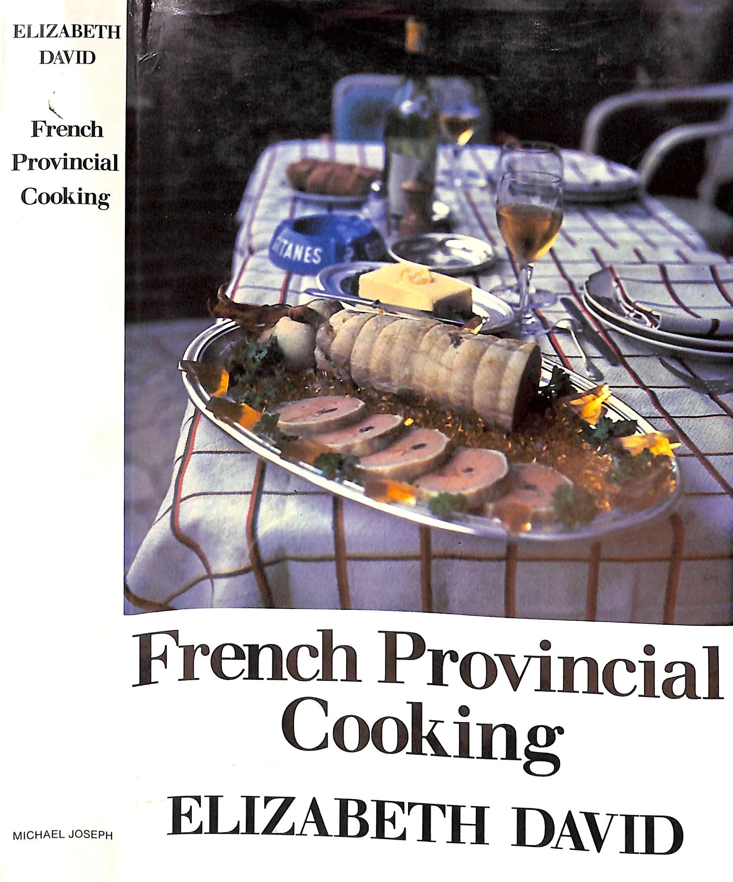


French being the theme and also sort of homely and rustic, with garlic being a popular image and the presentation becoming ever simpler, as time goes on. Everything really screaming French food.
So can you judge a book by its cover, seeing that cover design changes over time? Do we change too, or is it just fashion and we adapt? Different people are attracted to different images though aren't they? I suspect that authors of books don't have a huge say on the design of the cover - certainly as far as fiction is concerned anyway. The really 'big' authors may have a right of veto or at least are allowed a look, but ultimately it's all down to the publishers - the marketers. Those who are going to make most of the money from the book.
Although - David Lebovitz does seem to have had some say. After mentioning the fashion of good-looking people holding some food he goes on to say:

"It felt a little awkward for me to be on the cover of the book. And I didn’t want a picture of me holding a cake, looking off-camera at who-knows-what. So it was decided to feature a simple dessert on the cover."
It's certainly true that he is not a glamorous looking person - just a pleasant, mildly interesting looking one - shown here with the photographer Ed Anderson who took the shot on the cover of his book, whilst they were between photo shoots, and eating profiteroles in a bistro. David poured the chocolate sauce, and Ed snapped the shot so that:
"the shot became the cover of the book as it says it all - how much I love chocolate, how much I enjoy eating desserts, and the fun of eating in a Paris bistro. That smile on my face wasn’t for the camera - it’s because I was ready for dessert! And that’s what made the cover." David Lebovitz
To sum up - sort of. The cover's main intent is to grab your attention and sell the book. Every book is aimed at a particular market, however niche, and those little - and large - niches, generally are attracted to the same things, the same emotions, the same shades of meaning and topic. And so the cover is aimed at that market. David Lebovitz's is aimed at people who like making pastries and cakes, as well as being Francophiles, because the setting is somehow very French - he is first and foremost a pastry cook after all. Elizabeth David's French Provincial Cooking was aimed at francophiles who wanted to reproduce the food they had enjoyed on bucolic holidays in France. Jamie's are aimed at people who want simple amd easy but fun - and also sort of ordinary and familiar. Ottolenghi for the enthusiastic cooks - and on and on it goes. What catches my eye won't necessarily catch yours. You will be fans of different cooks to me. Food for thought though. That's what books are for.
YEARS GONE BY
September 30 - the end of another month - where did it go? I see we are into Halloween in the shops already and Christmas is creeping in. Aldi has panettone and yule logs ...
2024 - Nothing
2023 - Two English experiments
2020 - Missing
2019 - Nothing
2018 - The ubiquitous dip


Well as you rightly allude to: "Never judge a book by its cover"... but we all do, whether it is the model smiling out at us, or the familiarity of Liz David's French Provincial Cooking. But hold your horses... Liz David jars on's sensibility. She is utterly Elizabeth David and never Liz. And that's just one word on the cover, albeit an important one! 🤪